Plotting function for reliability measure.
Usage
CCplot(
  method1,
  method2,
  Ptype = "None",
  metrics = FALSE,
  xlabel = "",
  ylabel = "",
  title = "",
  subtitle = NULL,
  xrange = NULL,
  yrange = NULL,
  MArange = c(-3.5, 5.5)
)
Arguments
- method1
measurements obtained in batch 1 or using method 1
- method2
measurements obtained in batch 2 or using method 2
- Ptype
type of plot to be outputted c("scatter", "MAplot")
- metrics
if
TRUE, prints Rc, Ca, and R2 to console- xlabel
x-axis label for scatterplot
- ylabel
y-axis label for scatterplot
- title
title for the main plot
- subtitle
subtitle of plot
- xrange
range of x axis
- yrange
range of y axis
- MArange
MA range
Examples
# Simulate normally distributed data
set.seed(12)
a1 <- rnorm(20) + 2
a2 <- a1 + rnorm(20, 0, 0.15)
a3 <- a1 + rnorm(20, 0, 0.15) + 1.4
a4 <- 1.5 * a1 + rnorm(20, 0, 0.15)
a5 <- 1.3 * a1 + rnorm(20, 0, 0.15) + 1
a6 <- a1 + rnorm(20, 0, 0.8)
# One scatterplot
CCplot(a1, a2, Ptype = "scatter")
 m2 <- list(a1, a2, a3, a4, a5, a6)
mains <- c("Perfect Agreement", "Very Good Agreement", "Location Shift",
"Scale Shift", "Location and Scale Shift", "Measurement Error")
subs <- letters[1:6]
par(mfrow = c(3, 2), mar = c(5.1, 4.1, 1.5, 1.5))
# Scatterplots
mapply(function(y, t, s)
CCplot(method1 = a1, method2 = y, Ptype = "scatter",
xlabel = "X", ylabel = "Y", title = t, subtitle = s),
y = m2, t = mains, s = subs)
m2 <- list(a1, a2, a3, a4, a5, a6)
mains <- c("Perfect Agreement", "Very Good Agreement", "Location Shift",
"Scale Shift", "Location and Scale Shift", "Measurement Error")
subs <- letters[1:6]
par(mfrow = c(3, 2), mar = c(5.1, 4.1, 1.5, 1.5))
# Scatterplots
mapply(function(y, t, s)
CCplot(method1 = a1, method2 = y, Ptype = "scatter",
xlabel = "X", ylabel = "Y", title = t, subtitle = s),
y = m2, t = mains, s = subs)
 #> [[1]]
#> NULL
#>
#> [[2]]
#> NULL
#>
#> [[3]]
#> NULL
#>
#> [[4]]
#> NULL
#>
#> [[5]]
#> NULL
#>
#> [[6]]
#> NULL
#>
# MAplots and show metrics
mapply(function(y, t, s)
CCplot(method1 = a1, method2 = y, Ptype = "MAplot",
title = t, subtitle = s, metrics = TRUE),
y = m2, t = mains, s = subs)
#> [[1]]
#> NULL
#>
#> [[2]]
#> NULL
#>
#> [[3]]
#> NULL
#>
#> [[4]]
#> NULL
#>
#> [[5]]
#> NULL
#>
#> [[6]]
#> NULL
#>
# MAplots and show metrics
mapply(function(y, t, s)
CCplot(method1 = a1, method2 = y, Ptype = "MAplot",
title = t, subtitle = s, metrics = TRUE),
y = m2, t = mains, s = subs)
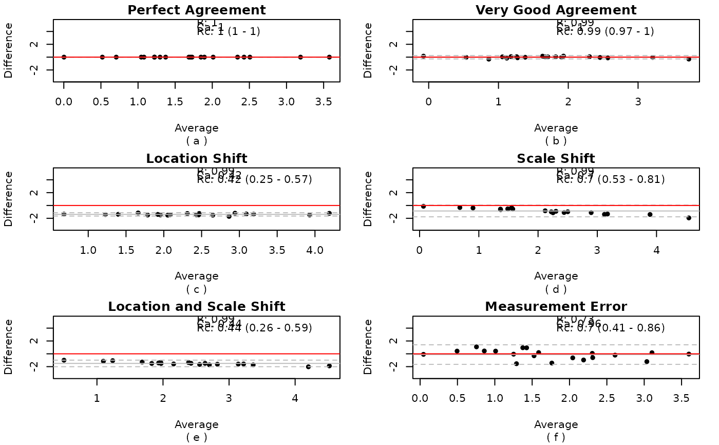 #> [,1] [,2] [,3] [,4] [,5] [,6]
#> Rc 1 0.99 0.42 0.70 0.44 0.70
#> Ca 1 1.00 0.42 0.70 0.44 0.96
#> R2 1 0.99 0.99 0.99 0.99 0.73
#> [,1] [,2] [,3] [,4] [,5] [,6]
#> Rc 1 0.99 0.42 0.70 0.44 0.70
#> Ca 1 1.00 0.42 0.70 0.44 0.96
#> R2 1 0.99 0.99 0.99 0.99 0.73